


从当初ie6连png透明都不支持的年代,到现在css3的各种绚丽的特效,技术的进步真是一日千里。
今天看到一个css3实现的3D ?iPhone 6的特效动画,真是名副其实的狂拽炫酷屌炸天!先看看效果图:
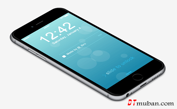
“我裤子都脱了,你就给我看这个jpg?”
表要着急,点击下面的运行看看效果,让你好好震精震精吧
纯CSS3实现3D特效的iPhone 6动画 ? DEMO
<!DOCTYPE html>
<html>
		<head>
		<meta charset="UTF-8">
		<title>CSS only iPhone 6 Frome www.tonjay.com</title>
		<style>
body { font-family: 'Helvetica', sans-serif; background: #f5f5f5; color: #333; letter-spacing: 1px; }
html, body { height: 100%; margin: 0; padding: 0; overflow: hidden; }
#wrapper { height: 520px; width: 800px; margin-left: -400px; margin-top: -260px; position: absolute; -webkit-perspective: 6000px; perspective: 6000px; top: 50%; left: 50%; }
#iphone { height: 760px; width: 372px; border-radius: 50px; position: absolute; background: none; box-shadow: none; left: 206px; top: -140px; -webkit-transform: rotateX(54deg) rotateZ(-46deg); transform: rotateX(54deg) rotateZ(-46deg); -webkit-transform-style: preserve-3d; transform-style: preserve-3d; }
#side { background: #CDD0D5; width: 393px; height: 780px; border-top-left-radius: 77px; border-bottom-left-radius: 49px; border-bottom-right-radius: 86px; border-top-right-radius: 70px; position: absolute; top: 5px; left: -26px; box-shadow: inset #3D3E42 0 0 15px 9px; }
#front { width: 362px; height: 750px; border-radius: 49px; position: absolute; background-image: -webkit-linear-gradient(-27deg, #444, #000 10%, #000 42%, #333, #000 57%, #000 91%, #444); left: 5px; top: 5px; box-shadow: inset #000 0 0 0 4px, #555 0px 0 3px 0px, #222 -3px 2px, #000 -5px 5px, #E0E0E0 -7px 6px 1px, #6D6D6D -7px 6px 9px; -webkit-transform: translateZ(1px); transform: translateZ(1px); }
#front-cover { width: 344px; height: 734px; background: #000; border-radius: 39px; position: absolute; top: 8px; left: 9px; }
#home { position: absolute; width: 52px; height: 52px; border-radius: 50%; background: -webkit-linear-gradient(58deg, #666, #000, #666); background: linear-gradient(32deg, #666, #000, #666); top: 684px; left: 160px; }
#home div { background: #000; border-radius: 50%; width: 46px; height: 46px; position: absolute; left: 3px; top: 3px; }
#camera { width: 11px; height: 11px; background: #000; position: absolute; top: 35px; left: 124px; border-radius: 50%; box-shadow: inset #666 -5px 2px 9px -2px; }
#camera div { width: 6px; height: 6px; background: -webkit-radial-gradient(#E1E4F5, #0D2B69 33%); background: radial-gradient(#E1E4F5, #0D2B69 33%); background-position: -1px -1px; position: absolute; top: 3px; left: 3px; border-radius: 50%; }
#speaker { width: 50px; height: 4px; border-radius: 2px; background: #555; position: absolute; top: 39px; left: 156px; box-shadow: inset #222 0 0px 4px; }
#volume { height: 128px; width: 11px; border-radius: 10px; position: absolute; background: #F9F9FA; top: 171px; left: -20px; -webkit-transform: rotateY(95deg); transform: rotateY(95deg); -webkit-transform-style: preserve-3d; transform-style: preserve-3d; box-shadow: inset #292A2F 4px 0 8px 1px, #D5D5D5 -1px 0px 2px; }
#volume div { width: 8px; height: 55px; background: #BBBCC0; border-radius: 10px; position: absolute; box-shadow: #eee -1px 1px, #777 -1px 3px, #505057 -3px 3px, inset #909197 -3px 0 3px; }
#volume div:first-child { top: 2px; left: 4px; }
#volume div:last-child { top: 69px; left: 4px; }
#toggler { height: 34px; width: 8px; border-radius: 10px; position: absolute; background: #2B2C31; top: 105px; left: -20px; -webkit-transform: rotateY(95deg); transform: rotateY(95deg); -webkit-transform-style: preserve-3d; transform-style: preserve-3d; box-shadow: inset #292A2F 4px 0 8px 1px, #D5D5D5 -1px 0px 2px; }
#toggler div { width: 4px; height: 31px; background: #BBBCC0; border-radius: 10px; position: absolute; box-shadow: #eee -1px 1px, #777 -2px 3px, #505057 -3px 3px, inset #909197 -3px 0 3px; top: -1px; left: 3px; }
#aux { width: 19px; height: 19px; background: #3B3B3B; border-radius: 50%; -webkit-transform: rotateX(90deg) translateZ(1px); transform: rotateX(90deg) translateZ(1px); -webkit-transform-style: preserve-3d; transform-style: preserve-3d; position: absolute; top: 766px; left: 45px; box-shadow: inset #000 6px -3px 10px 1px, #C7C7C7 1px 0px 1px; }
#lightning { width: 48px; height: 12px; border-radius: 10px; background: #3F3F3F; -webkit-transform: rotateX(90deg) translate3d(0px, 1px, 0px); transform: rotateX(90deg) translate3d(0px, 1px, 0px); top: 771px; position: absolute; left: 139px; box-shadow: inset #8E8F94 -1px 1px 0px 2px, #515258 0px 0px 0 1px, inset #000 0 -3px 10px, #DADADA 1px 0 0 1px; }
#bottom-speaker { position: absolute; -webkit-transform: rotateX(90deg); transform: rotateX(90deg); top: 781px; left: 70px; }
#bottom-speaker div { width: 8px; height: 8px; border-radius: 50%; background: #6C6D72; position: absolute; box-shadow: inset #000 1px -1px 4px 1px, #DADADA 1px 0px; }
#bottom-speaker div:nth-child(2) { left: 150px; }
#bottom-speaker div:nth-child(3) { left: 162px; }
#bottom-speaker div:nth-child(4) { left: 174px; }
#bottom-speaker div:nth-child(5) { left: 186px; }
#bottom-speaker div:nth-child(6) { left: 198px; }
#bottom-speaker div:nth-child(7) { left: 210px; }
#skrews { position: absolute; top: 780px; left: 120px; -webkit-transform: rotateX(90deg); transform: rotateX(90deg); }
#skrews div { position: absolute; width: 8px; height: 8px; background: rgb(95, 92, 92); border-radius: 50%; top: 0; z-index: 4; box-shadow: inset #999AA0 0 0 0px 2px, #444 1px 0px; }
#skrews div:last-child { left: 70px; }
#lines { position: absolute; top: 82px; left: -32px; }
#lines > div:last-child { top: 634px; }
#lines div { width: 7px; height: 11px; position: absolute; -webkit-transform-style: preserve-3d; transform-style: preserve-3d; -webkit-transform-origin: 100% 100%; -ms-transform-origin: 100% 100%; transform-origin: 100% 100%; }
#lines > div { background: -webkit-linear-gradient(right, #393A3C, #5A595E); background: linear-gradient(right, #393A3C, #5A595E); -webkit-transform: rotateY(90deg); transform: rotateY(90deg); }
#lines > div > div { background: -webkit-linear-gradient(right, #5A595E, #87868A); background: linear-gradient(right, #5A595E, #87868A); -webkit-transform: rotateY(17deg); transform: rotateY(17deg); left: -6px; }
#lines > div > div > div { background: -webkit-linear-gradient(right, #87868A, #A8A6AD); background: linear-gradient(right, #87868A, #A8A6AD); -webkit-transform: rotateY(17deg); transform: rotateY(17deg); left: -6px; }
#shadow { width: 350px; height: 755px; background: black; position: absolute; top: 5px; left: 0; -webkit-transform: translateZ(-17px); transform: translateZ(-17px); -webkit-transform-style: preserve-3d; transform-style: preserve-3d; box-shadow: #000 0 0 10px 15px; opacity: 0.4; border-top-left-radius: 76px; border-top-right-radius: 200px; border-bottom-left-radius: 40px; border-bottom-right-radius: 56px; }
#screen { background: -webkit-linear-gradient(#A1E5E5, #1987AA); background: linear-gradient(#A1E5E5, #1987AA); width: 336px; height: 589px; position: absolute; top: 80px; left: 13px; font-weight: 300; color: #fff; background-size: 200% 100%; overflow: hidden; }
#time { font-size: 86px; left: 57px; top: 37px; position: absolute; }
#date { font-size: 20px; left: 85px; top: 130px; position: absolute; }
#bottom { width: 37px; height: 7px; border-radius: 5px; background: #2AB1DB; position: absolute; top: 573px; left: 149px; }
#top { width: 37px; height: 7px; border-radius: 5px; background: #D7FFFF; position: absolute; top: 10px; left: 149px; }
#slide { position: absolute; top: 489px; left: 88px; font-size: 28px; color: #2AB1DB; background: -webkit-linear-gradient(left, #2EC4F3 30%, #fff, #2EC4F3 70%); background: linear-gradient(left, #2EC4F3 30%, #fff, #2EC4F3 70%); -webkit-background-clip: text; -webkit-text-fill-color: transparent; background-size: 350px; -webkit-animation: slide 5s linear infinite; animation: slide 5s linear infinite; }
 @-webkit-keyframes slide {  0% {
background-position: 100px 0;
}
 40% {
background-position: 440px 0;
}
 100% {
background-position: 440px 0;
}
}
 @keyframes slide {  0% {
background-position: 100px 0;
}
 40% {
background-position: 440px 0;
}
 100% {
background-position: 440px 0;
}
}
#slide div { -webkit-transform: rotate(135deg); -ms-transform: rotate(135deg); transform: rotate(135deg); border-left: 2px solid #2AB1DB; border-top: 2px solid #2AB1DB; width: 15px; height: 15px; position: absolute; left: -29px; top: 10px; }
#signal { position: absolute; top: 9px; left: 7px; }
#signal div { width: 6px; height: 6px; border-radius: 50%; background: #fff; border: 1px solid #fff; position: absolute; }
#signal div:nth-child(2) { left: 9px; }
#signal div:nth-child(3) { left: 18px; }
#signal div:nth-child(4) { left: 27px; }
#signal div:nth-child(5) { left: 36px; background: none; }
#battery { position: absolute; top: 3px; left: 270px; font-size: 13px; }
#battery > div:last-child { width: 27px; height: 9px; border: 1px solid #fff; position: absolute; top: 4px; left: 27px; border-radius: 2px; }
#battery div div:first-child { width: 21px; height: 7px; background: #fff; position: absolute; top: 1px; left: 1px; }
#battery div div:last-child { width: 1px; height: 6px; background: #FFF; position: absolute; left: 29px; top: 2px; border-radius: 0 1px 1px 0; }
#fabrizio { border-top: 100px solid black; border-right: 63px solid transparent; width: 0; -webkit-transform: scale(.33); -ms-transform: scale(.33); transform: scale(.33); -webkit-transform-origin: 0 0; -ms-transform-origin: 0 0; transform-origin: 0 0; margin: 20px; opacity: .6; position: absolute; bottom: -130px; }
#fabrizio:before { background: black; width: 20px; height: 30px; content: ''; display: block; -webkit-transform: skewX(-32deg); -ms-transform: skewX(-32deg); transform: skewX(-32deg); position: relative; top: -65px; left: 29px; }
#fabrizio:after { background: black; width: 40px; height: 36px; content: ''; display: block; -webkit-transform: skewX(-32deg); -ms-transform: skewX(-32deg); transform: skewX(-32deg); position: relative; top: -130px; left: 49px; }
#circle { width: 50px; height: 50px; background: none; border-radius: 50%; box-shadow: rgba(255,255,255,0.1) 160px 335px, rgba(255,255,255,0.1) 120px 275px 0 12px, rgba(255,255,255,0.1) 60px 355px 0 23px, rgba(255,255,255,0.1) 230px 445px 0 -8px, rgba(255,255,255,0.1) 60px 125px, rgba(255,255,255,0.1) 260px 145px 0 12px, rgba(255,255,255,0.1) 300px 145px 0 23px, rgba(255,255,255,0.1) 100px 85px 0 -8px, rgba(255,255,255,0.1) 50px 155px, rgba(255,255,255,0.1) 150px 273px 0 -2px, rgba(255,255,255,0.1) 50px 555px 0 23px, rgba(255,255,255,0.1) 180px 5px 0 -8px; -webkit-animation: circle 30s linear infinite alternate; animation: circle 30s linear infinite alternate; }
 @-webkit-keyframes circle {  0% {
 box-shadow: rgba(255,255,255,0.1) 160px 335px, rgba(255,255,255,0.1) 120px 275px 0 12px, rgba(255,255,255,0.1) 60px 355px 0 23px, rgba(255,255,255,0.1) 230px 445px 0 -8px, rgba(255,255,255,0.1) 60px 125px, rgba(255,255,255,0.1) 260px 145px 0 12px, rgba(255,255,255,0.1) 300px 145px 0 23px, rgba(255,255,255,0.1) 100px 85px 0 -8px, rgba(255,255,255,0.1) 350px 555px, rgba(255,255,255,0.1) 350px 273px 0 -2px, rgba(255,255,255,0.1) 150px 355px 0 23px, rgba(255,255,255,0.1) 180px 205px 0 -8px, rgba(255,255,255,0.1) 0px 0px 0 -8px, rgba(255,255,255,0.1) 100px 555px 0 10px;
}
 100% {
 box-shadow: rgba(255,255,255,0.1) 70px 10px, rgba(255,255,255,0.1) 300px 205px 0 12px, rgba(255,255,255,0.1) 0px 155px 0 23px, rgba(255,255,255,0.1) 330px 45px 0 -8px, rgba(255,255,255,0.1) 460px 325px, rgba(255,255,255,0.1) 0px 445px 0 12px, rgba(255,255,255,0.1) 300px 145px 0 23px, rgba(255,255,255,0.1) 100px 85px 0 -8px, rgba(255,255,255,0.1) 50px 155px, rgba(255,255,255,0.1) 150px 273px 0 -2px, rgba(255,255,255,0.1) 0px 555px 0 23px, rgba(255,255,255,0.1) 180px 5px 0 -8px, rgba(255,255,255,0.1) 300px 555px 0 -8px, rgba(255,255,255,0.1) 350px 355px 0 10px;
}
}
 @keyframes circle {  0% {
 box-shadow: rgba(255,255,255,0.1) 160px 335px, rgba(255,255,255,0.1) 120px 275px 0 12px, rgba(255,255,255,0.1) 60px 355px 0 23px, rgba(255,255,255,0.1) 230px 445px 0 -8px, rgba(255,255,255,0.1) 60px 125px, rgba(255,255,255,0.1) 260px 145px 0 12px, rgba(255,255,255,0.1) 300px 145px 0 23px, rgba(255,255,255,0.1) 100px 85px 0 -8px, rgba(255,255,255,0.1) 350px 555px, rgba(255,255,255,0.1) 350px 273px 0 -2px, rgba(255,255,255,0.1) 150px 355px 0 23px, rgba(255,255,255,0.1) 180px 205px 0 -8px, rgba(255,255,255,0.1) 0px 0px 0 -8px, rgba(255,255,255,0.1) 100px 555px 0 10px;
}
 100% {
 box-shadow: rgba(255,255,255,0.1) 70px 10px, rgba(255,255,255,0.1) 300px 205px 0 12px, rgba(255,255,255,0.1) 0px 155px 0 23px, rgba(255,255,255,0.1) 330px 45px 0 -8px, rgba(255,255,255,0.1) 460px 325px, rgba(255,255,255,0.1) 0px 445px 0 12px, rgba(255,255,255,0.1) 300px 145px 0 23px, rgba(255,255,255,0.1) 100px 85px 0 -8px, rgba(255,255,255,0.1) 50px 155px, rgba(255,255,255,0.1) 150px 273px 0 -2px, rgba(255,255,255,0.1) 0px 555px 0 23px, rgba(255,255,255,0.1) 180px 5px 0 -8px, rgba(255,255,255,0.1) 300px 555px 0 -8px, rgba(255,255,255,0.1) 350px 355px 0 10px;
}
}
#reminder ,#reminder2 { position: absolute; top: 230px; left: 40px; width: 296px; height: 50px; border-top: 1px solid #86E2F0; border-bottom: 1px solid #86E2F0; line-height: 50px; font-weight: 400; opacity: 0; -webkit-animation: reminder .1s linear forwards 5s; animation: reminder .1s linear forwards 5s; }
#reminder div:first-child,#reminder2 div:first-child { background: #fff; width: 16px; height: 16px; border-radius: 3px; position: absolute; top: 18px; }
#reminder div:nth-child(2),#reminder2 div:nth-child(2) { position: absolute; left: 30px; }
#reminder div:last-child ,#reminder2 div:last-child{ position: absolute; left: 251px; font-size: 11px; color: #86E2F0; }
 @-webkit-keyframes reminder {  100% {
 opacity: 1;
}
}
 @keyframes reminder {  100% {
 opacity: 1;
}
}
#awwwards { position: absolute; bottom: 30px; left: 70px; }
#awwwards a { color: #444; text-decoration: none; border-bottom: 1px solid #888; }
#coolors { position: absolute; bottom: 30px; right: 30px; color: #444; text-decoration: none; border-bottom: 1px solid #888; -webkit-animation: coolors 1s infinite; animation: coolors 1s infinite; opacity: 1; }
 @-webkit-keyframes coolors {  50% {
right: 40px;
}
}
 @keyframes coolors {  50% {
right: 40px;
}
}
</style>
		</head>
		<body>
        <div id="wrapper">
          <div id="iphone">
            <div id="side"></div>
            <div id="lines">
              <div>
                <div>
                  <div></div>
                </div>
              </div>
              <div>
                <div>
                  <div></div>
                </div>
              </div>
            </div>
            <div id="toggler">
              <div></div>
            </div>
            <div id="aux"></div>
            <div id="lightning"></div>
            <div id="bottom-speaker">
              <div></div>
              <div></div>
              <div></div>
              <div></div>
              <div></div>
              <div></div>
              <div></div>
            </div>
            <div id="skrews">
              <div></div>
              <div></div>
            </div>
            <div id="volume">
              <div></div>
              <div></div>
            </div>
            <div id="front">
              <div id="front-cover"></div>
              <div id="camera">
                <div></div>
              </div>
              <div id="speaker"></div>
              <div id="screen">
                <div id="reminder">
                  <div></div>
                  <div>Made by @_fbrz</div>
                  <div>now</div>
                </div>
                <div id="reminder2" style="top:281px;">
                  <div></div>
                  <div>From www.tonjay.com</div>
                  <div>21:23</div>
                </div>
                <div id="circle"></div>
                <div id="time">12:42</div>
                <div id="date">Saturday, January 4</div>
                <div id="bottom"></div>
                <div id="top"></div>
                <div id="slide">
                  <div></div>
                  slide to unlock </div>
                <div id="signal">
                  <div></div>
                  <div></div>
                  <div></div>
                  <div></div>
                  <div></div>
                </div>
                <div id="battery">
                  <div>86%</div>
                  <div>
                    <div></div>
                    <div></div>
                  </div>
                </div>
              </div>
              <div id="home">
                <div></div>
              </div>
            </div>
            <div id="shadow"></div>
          </div>
        </div>
</body>
</html>


 川公网安备 51010702002669号

 18605917465
 客服QQ
客服QQ